A while back I posted some thoughts about branding, particularly the wisdom of calling a blog meant to be engaging and playful “Somber and Dull”. That generated some fun feedback and, in the end, I’m happy sticking with the title. There certainly is no competition for the domain name.
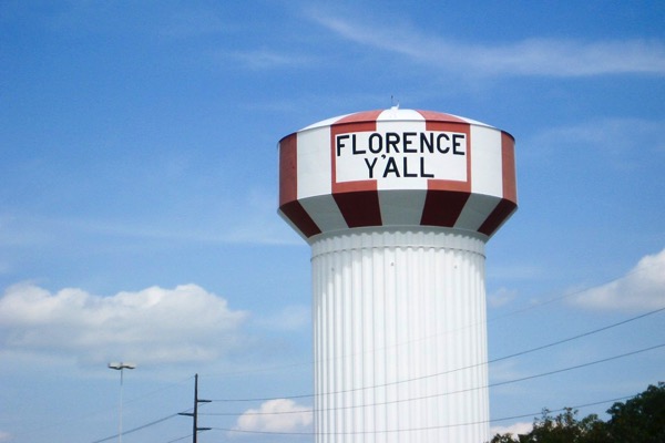
While these things were on my mind, I ran across this picture of the Florence (Kentucky) Mall in the online edition of the Atlantic Monthly.

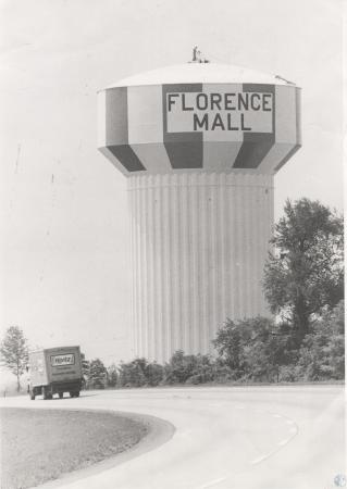
I was reminded that a branding vs. local ordinance issue led to that distinctive water tower message. Originally, as can be seen here, the water tower was painted with the name of the mall on whose property it resides.  It seemed like a good, though drab, way for the mall to attract the attention of passing motorists.
But then, as I understood it (I lived nearby at the time) local officials protested that commercial advertising was not permitted on water towers or other structures that high. Faced with the prospect of having to repaint the whole water tower, some brilliant person suggested that the two side bars of the ‘M’ in ‘Mall’ be whited over and a stem placed beneath the remaining two lines, forming a ‘Y’. With the addition of the apostrophe, a visual impression was created that is now far more noticed than the original ever would have been. (It has since been re-painted, repeatedly, so that the ‘Y’ looks far more ‘Y-ish’. Originally, it looked like a converted ‘M’.)
There is no moral to this, no reason to point it out other than the fact that I find it interesting and to bemoan that no such event has occurred to make “Somber and Dull” more noticeable to a passing world.

Adri
I love it! Also love folks’ ingenuity. It’s one of those things that make me say, “Now why didn’t I think of that?”
Now if only I could think of a solution to stop insomnia. (It’s 4:30 AM.) Even a dull and somber blog doesn’t work!
Randy Greenwald
I have some sermons that might do the trick…