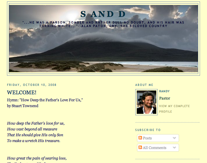
Thanks to all of you who so kindly expressed your opinion about a format change for this blog. I was fascinated by the comments about how certain colors better fit the blog’s title ‘Somber and Dull’. It’s as if some forget that the title is meant to be, uh, ironic. But more on that later.
Fiona kindly invested some time in showing me what could be done with one of the formats, in terms of color and such – things I did not know were possible. Her sample is pictured here. (Thank you, Fiona. Where’d you find that picture of me?) So, taking her lead, I’ve modified one of the provided templates. 
I hope you all like it. If it is hard to read, please let me know!
And, I hope the colors are somber and dull enough for you.
I had to stay up and watch the Phillies – Dodgers game to get this done. But, hey, some sacrifices just have to be made.

Seth
Nice. I like the balance between the “Cleanness” of the white that I liked and the richness of the others. It works quite well. A large improvement, no doubt about it.
Randy Greenwald
That is precisely what it is. Thanks for the compliment.